 Skip to content
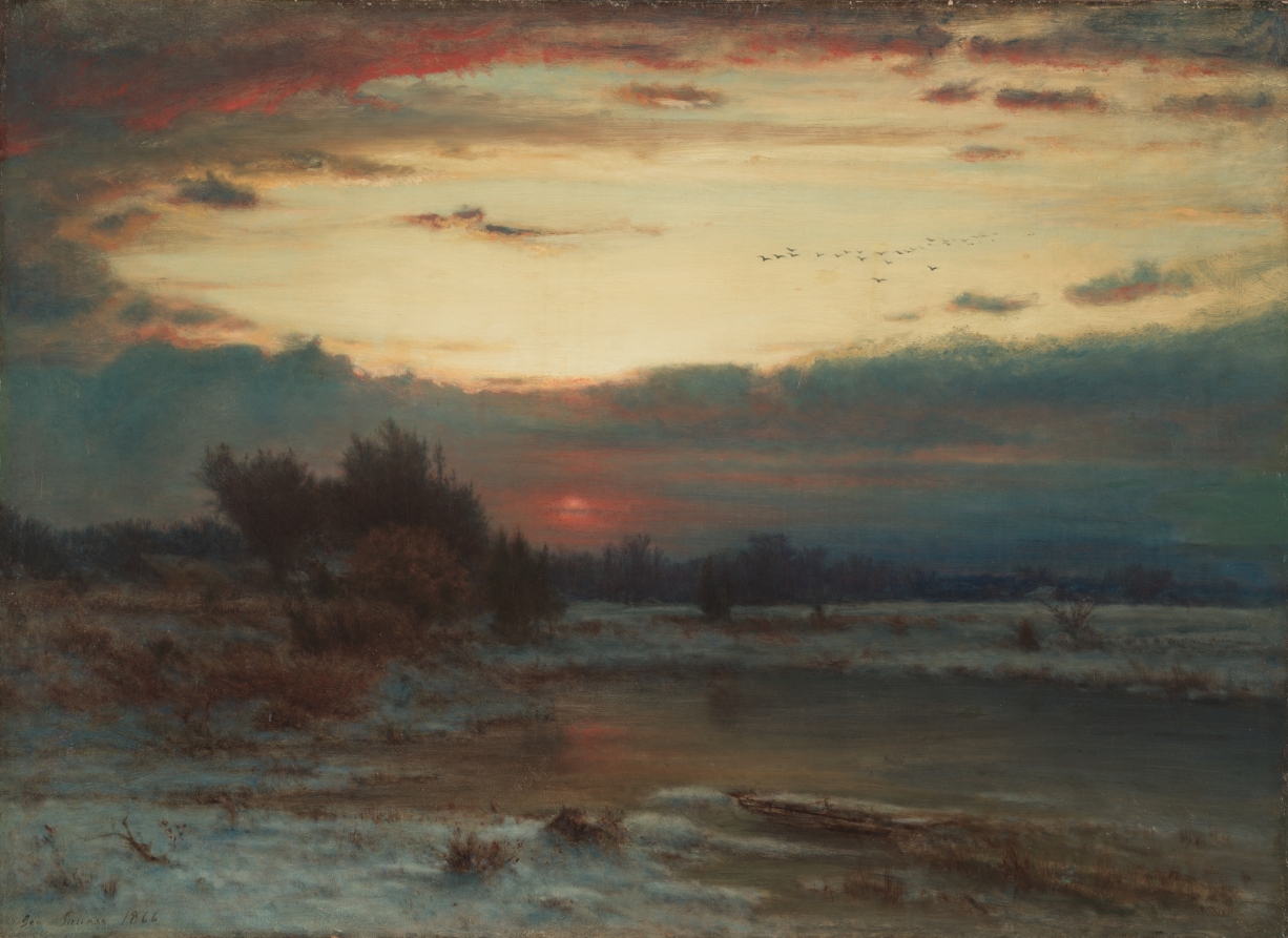
A winter landscape can hold two temperatures at once. The ground seems cold enough to feel through your shoes, while the last light above it is warm, almost ember-colored. George Inness’s A Winter Sky gives that contrast a whole evening to unfold. For this Art&Color study, it offers a way to combine frosted blues, dark botanical shapes, and a small, glowing touch of red.
A landscape built around the light
Inness was an American artist who lived from 1825 to 1894. He painted A Winter Sky in 1866; the unframed canvas measures 56 by 77.5 centimetres. The Cleveland Museum of Art identifies the contrast between warm sky colors and the cool frozen landscape as central to the work. It also records a small change that is easy to miss: Inness originally painted a person beside the left edge of the pond, then painted the figure out.
We cannot know from that change alone why he wanted the figure to disappear. What we can see in the finished painting is a landscape with no clearly visible human figure competing for attention. The broad sky, the low sun, and the pond become the places where our eyes pause. These historical details come from the museum’s collection entry; the color exercises that follow are our own interpretation.
Look for the narrow warm notes
The reproduced image has a wide, pale yellow opening in its sky. Below it, blue-grey clouds gather into a heavy band. A red-orange glow sits low near the center, and quieter warm traces appear along the clouds and in the water. Dark shrubs on the left and scattered bare growth across the foreground give the softer areas something firmer to meet.
For a maker, the useful question is how much warmth the composition needs. A bright accent becomes more noticeable when its neighbors are subdued. Try covering the reddish area with a fingertip while looking at the image, then uncovering it. Notice how that small passage changes the feeling of the surrounding greys.
Five colors for a winter-evening study
These are descriptive suggestions for a bead palette, not pigment identifications, manufacturer matches, or exact colors sampled from the painting. Your screen and the light at your worktable will both affect how they appear.
- Smoky blue-grey: the main cool color, echoing the cloud bank and frozen ground.
- Frosted pale blue: a lighter companion that keeps the winter areas readable.
- Deep bark brown: a structural shade for a stem, outline, or dark edge.
- Soft straw gold: a gentle light color, inspired by the open sky rather than a brilliant metallic finish.
- Muted ember red: a small warm accent that can draw the eye without taking over.
Place the colors together before stitching. If the bark brown and smoky blue-grey are almost indistinguishable, choose a slightly lighter blue-grey or a darker brown. When a motif depends on a thin outline, the difference between light and dark may matter more than finding the perfect hue.
Make two small samples
Start with a short band or simple rectangle in a familiar stitch, using beads of the same suitable size and shape. Give most of the space to the two cool shades. Add a narrow dark line, then a few warm beads grouped near one point. Keep the sample modest enough that changing it feels easy.
Make a second version with the same colors and overall dimensions, but spread the warm beads more evenly. Compare the two from arm’s length. Does the clustered accent suggest a place to look, while the scattered version feels more decorative? Neither result is wrong. The exercise helps you decide whether your next piece needs a focal point or an all-over rhythm.
For a botanical variation, turn the dark line into a simple bare stem. Keep its branches sparse so the pale background remains visible. This is an original design exercise prompted by looking at the landscape, not a claim about the inspiration behind an existing Lady Lunar Cat pattern.
Check the glow in real light
A shiny bead may appear much brighter than a matte bead of a similar color. Test your little study in daylight and under the lamp where you normally work. If the warm accent becomes too insistent, try a duller finish before changing the entire palette. Follow the material requirements of any existing pattern, and test substitutions separately.
Inness’s winter evening encourages a patient kind of looking. The shrubs are dark, the ground is cold, and yet the sky holds its warmth. A few carefully placed colors can carry that same quiet contrast into a small piece made by hand.
Sources: Cleveland Museum of Art collection record and Open Access policy. Artwork facts are museum-sourced; the palette, observations, and making exercises are original editorial interpretation.