 Перейти до змісту
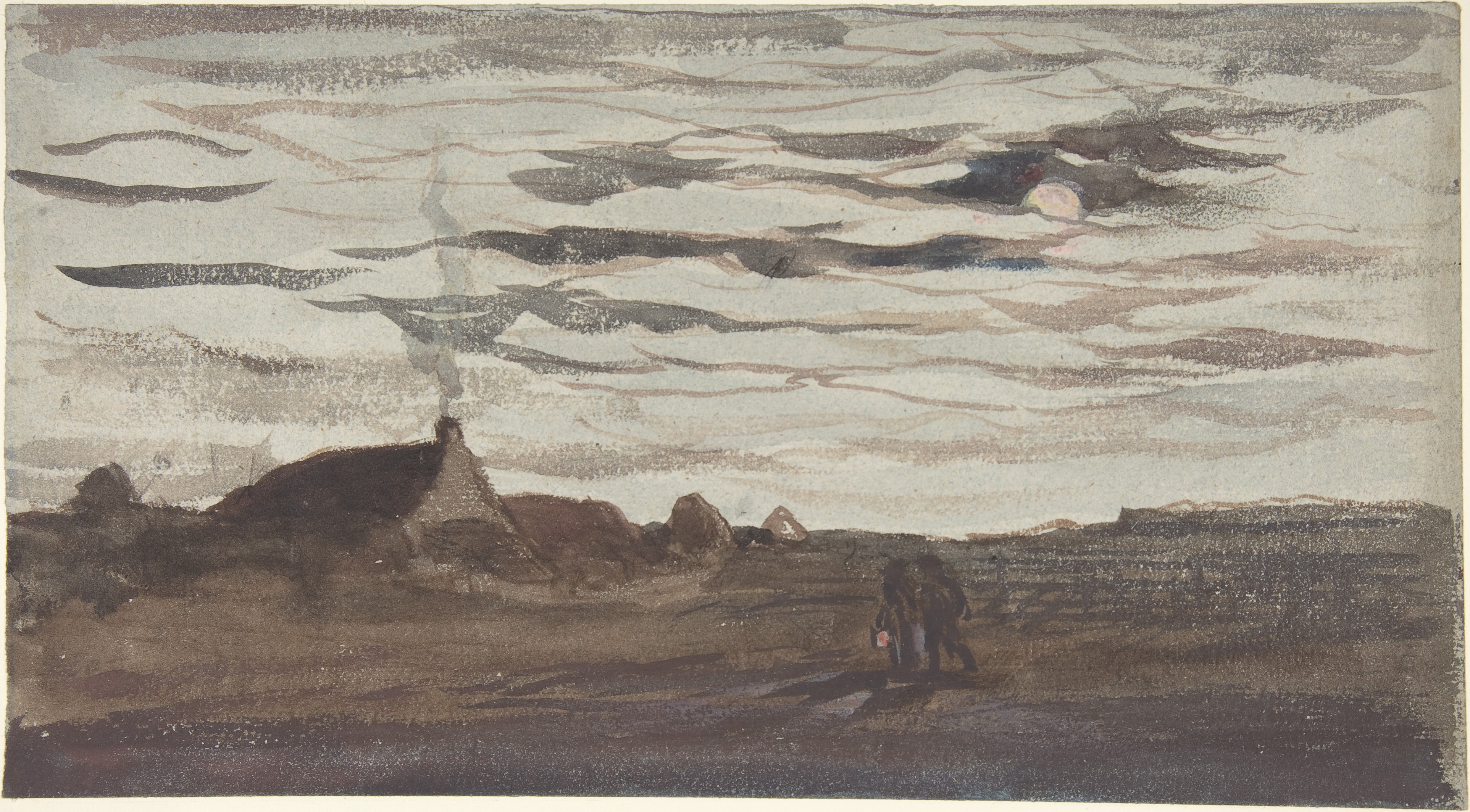
On a dark evening, the smallest warm color can hold your attention. A window, a lamp, or a little red glow suddenly feels more vivid than the whole landscape around it. Charles-François Daubigny’s Moonlight offers a lovely starting point for exploring that effect in beadwork: broad, quiet colors with one small accent that asks us to look again.
A quiet watercolor, close at hand
The Metropolitan Museum of Art dates this work to about 1860 and identifies its medium as watercolor. The sheet measures only 16 by 29.4 centimetres. Daubigny was French, born in Paris in 1817 and dying there in 1878. These are modest facts for a modestly sized work, and they invite a slower kind of looking: imagine holding a small sketchbook rather than standing before a vast canvas.
In the museum’s digital image, long, uneven bands of cloud stretch across much of the surface. A pale moon appears toward the upper right, while roofs and low, dark land occupy the bottom. Near the foreground figures, a tiny red light breaks the restrained color scheme. The watercolor has a grainy, broken appearance in places, with pale specks interrupting darker passages.
The museum does not identify this as a winter scene. Our connection to the season comes from its evening atmosphere and the pleasure of working with muted colors during the longer nights. The color study that follows is an original interpretation, not a reconstruction of Daubigny’s materials or intentions.
Let a small accent do the work
Before choosing colors, consider their proportions. Most of this image belongs to greys and subdued earth tones; the red detail occupies very little space. That relationship is useful when a beadwork design needs warmth without becoming busy.
Try laying out a generous group of neutral beads beside just one or two warm accent beads. The accent may already feel strong enough. Increasing its quantity can change the mood quickly, turning a quiet suggestion of lamplight into a dominant stripe or patch. Neither result is wrong, but it helps to make the choice deliberately.
A palette for cloudy evenings
These names describe a possible response to the image rather than exact sampled colors. Choose equivalent shades from your own supplies, remembering that a screen and a physical bead will never behave identically.
- Cloud grey: a middle-value grey for the largest area, calm enough to sit behind other colors.
- Dusty mauve: a subdued purple-grey that can soften the boundary between warm and cool shades.
- Earth brown: a quiet, weathered color for darker shapes or a grounded border.
- Pale ivory: a restrained light shade for a small moonlike highlight or open space.
- Lantern red: a muted warm red, used sparingly as the point of attention.
Place the grey, mauve, and brown together first. If they look almost identical in your working light, choose one lighter or darker alternative. Small-scale beadwork often needs clearer value differences than a watercolor, where overlapping marks and subtle changes can carry the form.
Make two versions of one small study
For a practical exercise, use a familiar, simple swatch with the correct beads and thread for your chosen stitch. Arrange a dark band, a middle-tone field, and a small pale area. Add a single red accent near one side rather than automatically placing it in the centre. This is a color experiment, so the sample can remain very small.
Make a second version with the red moved to a different position. Compare them at arm’s length. Does your eye settle in a different place? Does the pale area still feel important? Changing the position of one bead can reveal more than adding several new colors.
If you enjoy botanical motifs, try the same limited palette in your own simple leaf or seed-head sketch. Let the brown carry the outline and keep the red separate as a tiny accent. This is a suggested extension of the color exercise, not a botanical subject claimed for Daubigny’s painting.
Keep the finish in the conversation
A shiny red bead may catch far more light than a matte one. Test both if you have them, and view the sample under daylight and your evening lamp. Keep any existing pattern’s bead dimensions and construction requirements intact. This study does not supply a new pattern or identify an existing Lady Lunar Cat design as inspired by Daubigny.
For a quiet winter project, a few well-chosen shades can be enough. Give the greys room, keep the warm accent small, and see how much atmosphere fits into a handful of beads.
Artwork facts: The Metropolitan Museum of Art. Image rights: The Met’s Open Access policy. Visual observations refer to the museum’s digital image; palette names and making exercises are original interpretation.